Jaipur, India
A consciously curated women's clothing brand
(Year)
2023 - Present
(Services)
(Links)
Website
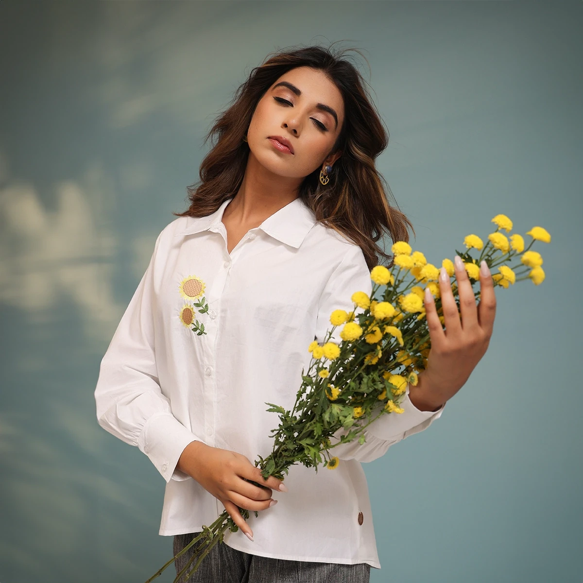

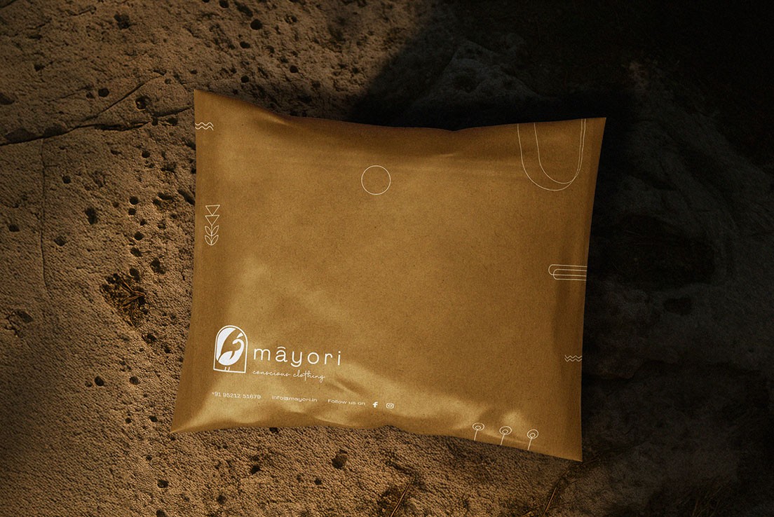
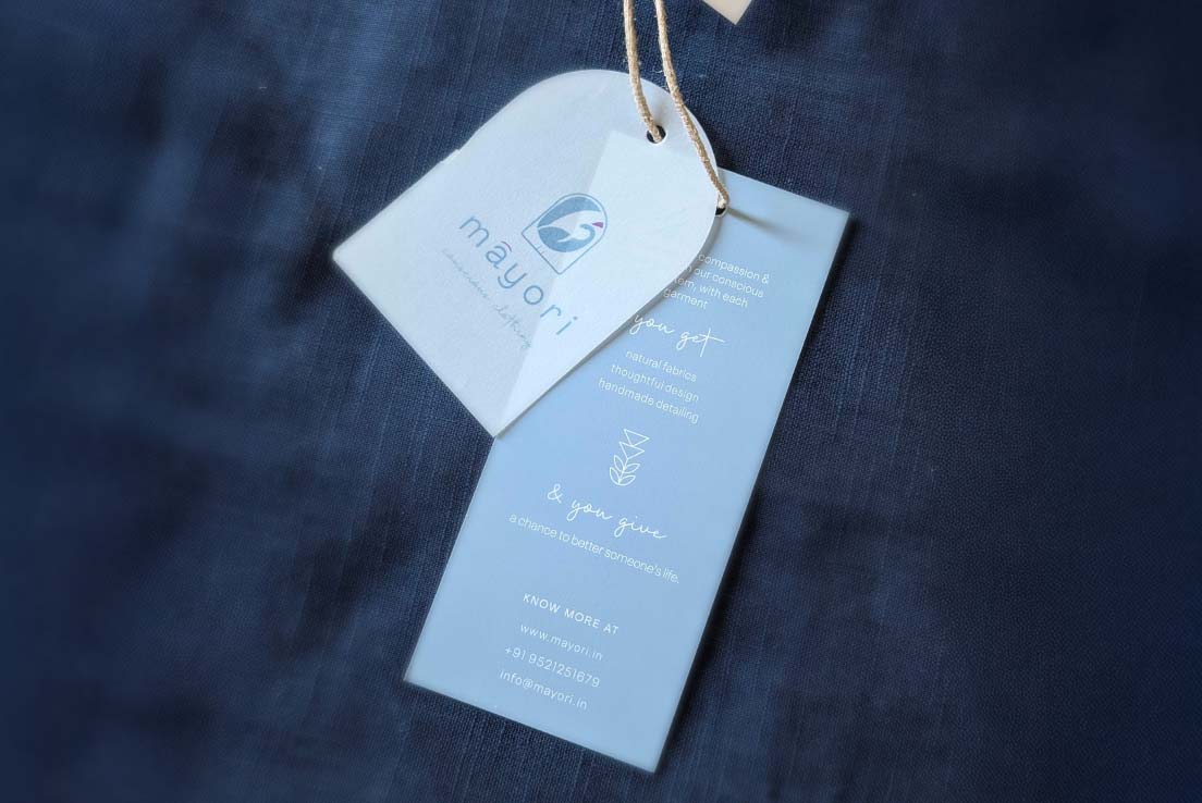
Mayori is a conscious fashion label rooted in natural fabrics, thoughtful design, and timeless style. Their offerings include contemporary ethnic wear for women that balances Indian aesthetics with everyday functionality. Based out of India, Mayori targets urban women who value sustainability without compromising on style.
When Mayori approached Butter Co, they were at a critical inflection point. As a homegrown brand with a strong foundation in conscious fashion and natural fabrics, Mayori had cultivated a loyal offline presence — particularly among boutique shoppers and eco-conscious customers. However, they were struggling to replicate that success in the digital space.
Here’s what we identified as the core challenges:
⤷
Inconsistent Brand Identity Online
While their values were clear — sustainability, softness, comfort — their visual and verbal identity online lacked coherence.
The Instagram feed felt disjointed, with no consistent aesthetic or message.
Product pages weren’t telling the full story behind the fabrics or silhouettes.
There was a disconnect between the richness of the brand and how it appeared across platforms.
⤷
Underperforming Digital Campaigns
Despite running ads, the returns were minimal.
ROAS was inconsistent, and CAC was steadily rising.
Campaign creatives lacked strategic direction — they felt generic and failed to communicate Mayori’s unique value proposition.
Targeting was broad and untailored, leading to irrelevant impressions and low engagement.
⤷
Weak Content Pipeline
Mayori had a beautiful product line — but not enough storytelling to back it.
Product shots were utilitarian, not aspirational.
There were few lifestyle visuals that showcased how the clothes looked in real settings.
Content fatigue had set in; audiences weren’t engaging with repetitive or low-context visuals.
⤷
Plateaued Online Growth
Even with a functional Shopify site and some social presence, sales had plateaued.
There was no clear funnel guiding new visitors to purchase.
Engagement was low and inconsistent, with no content rhythm or community-building strategy.
The brand wasn’t showing up where its target customers were searching or scrolling.
⤷
Limited Brand Recall in a Crowded Market
In the saturated world of indie fashion labels, Mayori had all the right ingredients — but wasn’t standing out.
Their USPs (natural fabrics, comfort-first design, sustainability) weren’t being communicated clearly or often.
With newer D2C brands entering the space, Mayori risked getting lost in the noise.
They didn’t just need more visibility — they needed a strategic brand overhaul, tighter performance metrics, better storytelling, and a creative partner who understood fashion, lifestyle, and the digital ecosystem.
Enter

(How we work)
Mayori needed more than just a marketing boost — they needed a digital rebirth that stayed true to their roots while connecting with today’s conscious consumer. Butter Co. came onboard as a full-spectrum creative and performance agency, integrating storytelling, strategy, and scalability.
Here's how we approached it:


01
To visually enhance the brand with chic contemporary wear persona
02
Emphasize on brand's conscious credentials
03
Highlighting product detailing
01
Keywords
Classy | Statement | Unique | Premium
02
Inspired by
Japanese Design Sensibilities | Progressive Approach | Minimalism with a punch

⤷
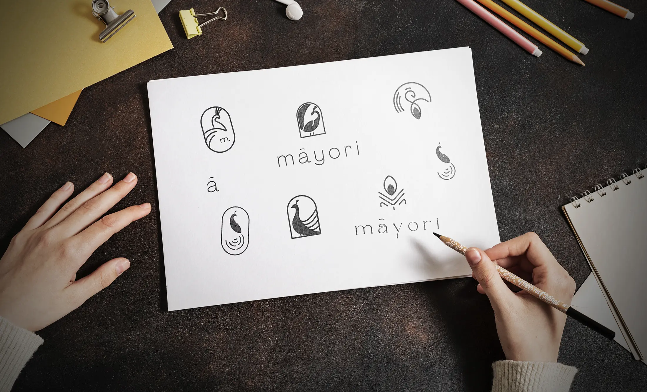
Objective
A modernised peacock symbol
Emphasis on pronunciation of the brand name by inserting diacritic over ā
⤷
Mood Board
Despite running ads, the returns were minimal.
ROAS was inconsistent, and CAC was steadily rising.
Campaign creatives lacked strategic direction — they felt generic and failed to communicate Mayori’s unique value proposition.
Targeting was broad and untailored, leading to irrelevant impressions and low engagement.

⤷
Why Peacock Symbol?
An exotic bird that symbolizes enigma, splendour... a living being whose sound is often heard and you can feel it is around but it isn't easy to see. Only when you find yourself amidst dense green cover of nature, when you know that rains are coming, when you hear that exotic sound... away from urban jungle, you know they are around but still nowhere to be seen.... feels just behind that branch of a beautiful tree.
Mayori is this exact feeling of enigma, splendour and natural consciousness.
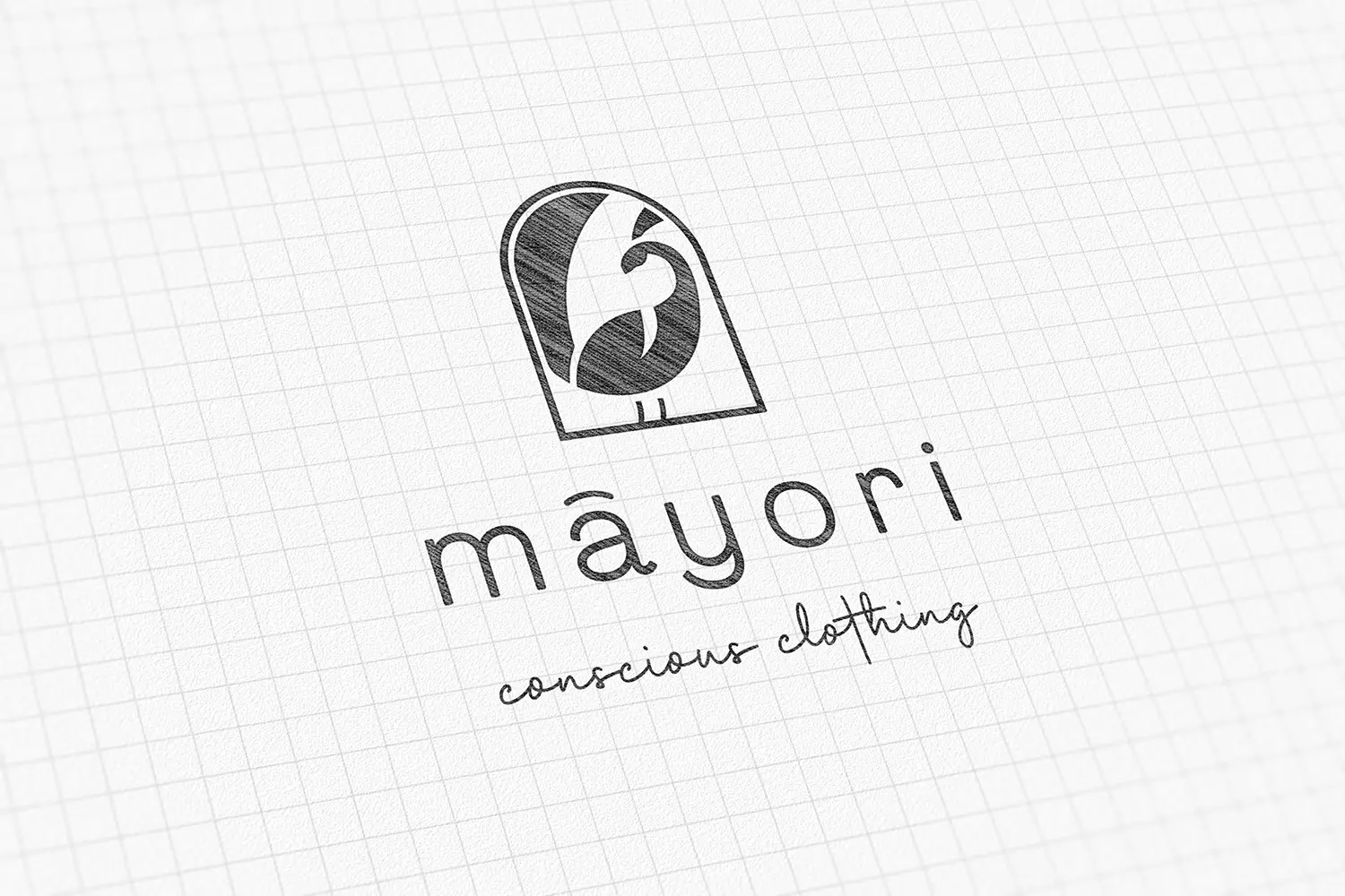
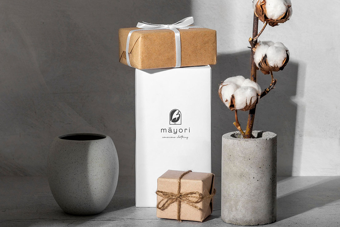
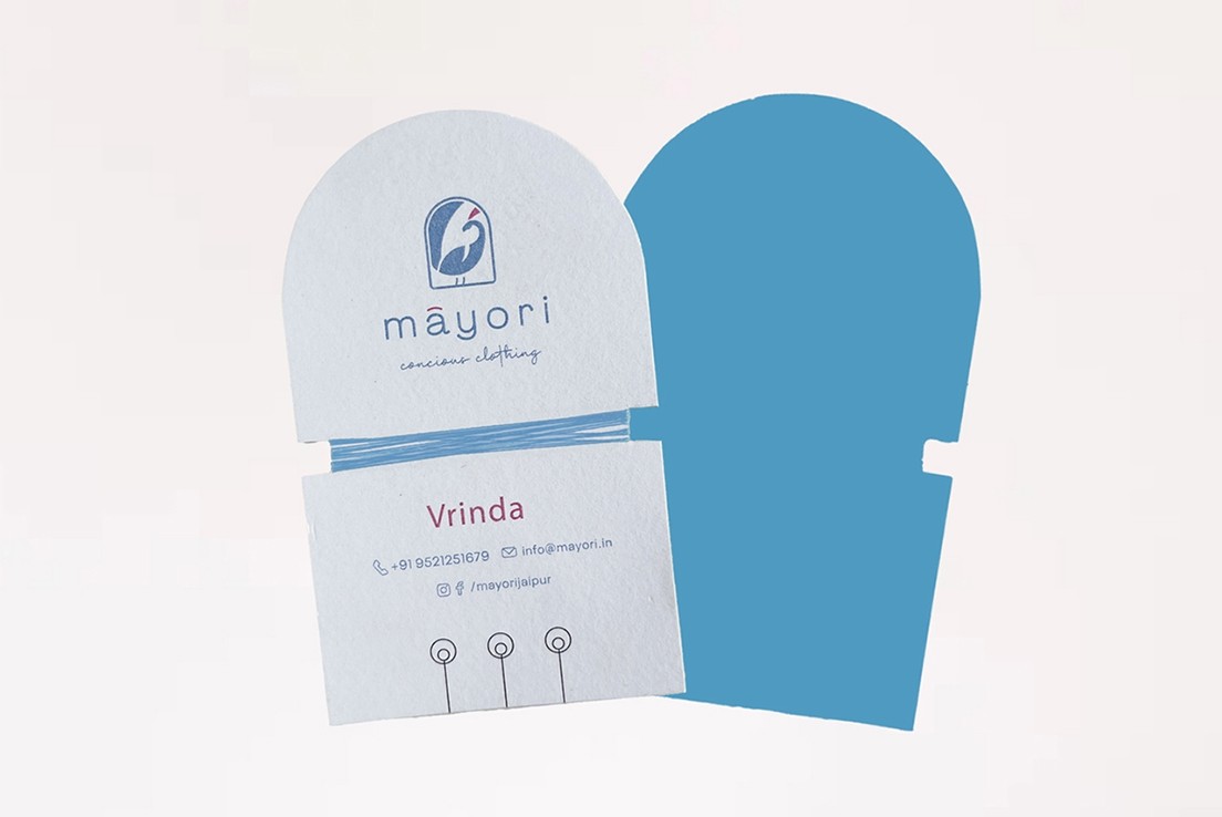
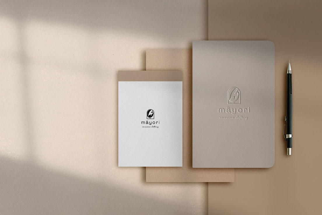
Final Logo
⤷
Objective
Modern
Hint of traditional
Versatile for Indian Ethnic & Western wear
⤷
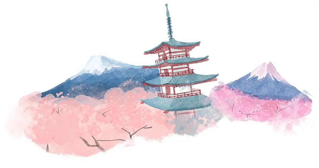
Mood Board
A serene palette inspired by Mount Fuji and cherry blossoms, blending the mountain's cool majesty with the delicate beauty of the blooms.
⤷
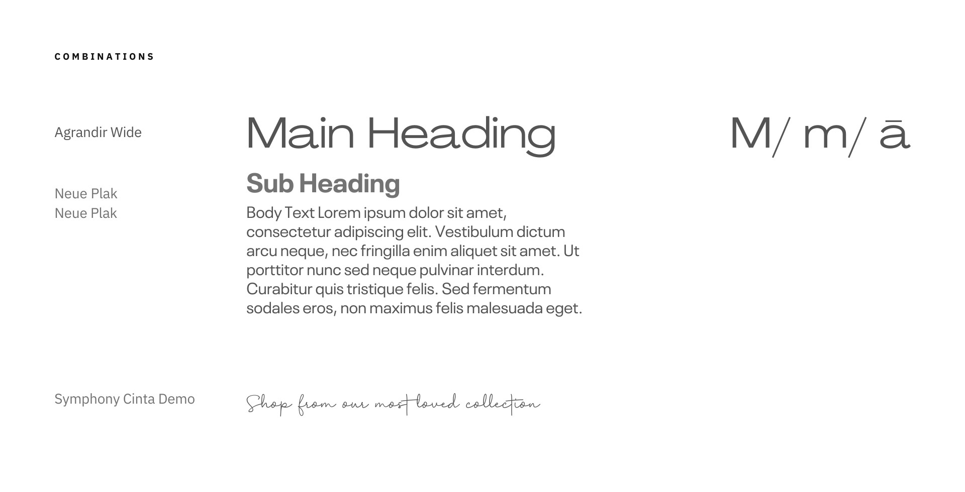
Objective
Distinct & Timeless typeface
International Appeal


(Testimonials)
(02)
See what our satisfied clients say about working with us.